Chosen theme: The Role of Typography in Visual Organization. Explore how letterforms, spacing, and hierarchy quietly choreograph attention and meaning on every screen. Subscribe for weekly, practical type insights and share your layout questions so we can learn together.
By varying size, weight, and case, you create a visual freeway of lanes where headlines lead, subheads pace, and body text anchors. Try adjusting just two levels today and tell us how your scan patterns changed.
Headings that Map Meaning
Clear, descriptive headings act like signposts, compressing complexity into graspable chunks. Write them as promises, not labels, and pair with consistent spacing so readers predict structure. Share a before-and-after screenshot of your headings hierarchy.
Microcopy as Signposts
Captions, labels, and helper text carry surprising organizational power. When aligned and styled consistently, they whisper directions at just the right moment. Add one clarifying microcopy line today and comment on how it changed user behavior.
Legibility vs. Readability: The Invisible Backbone
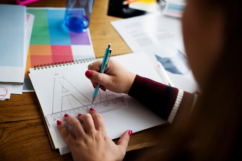
Typefaces with generous x-height, open apertures, and clear counters stay legible at small sizes. Compare two body fonts on your article and pick the one that keeps letters airy under pressure. Post your findings for feedback.
Legibility vs. Readability: The Invisible Backbone
Aim for roughly 45–75 characters per line and leading around 1.4–1.6 for body text. These ranges reduce saccades and fatigue, improving comprehension. Test two line-length variants and tell us which earned longer dwell time.
Grids, Alignment, and Typographic Rhythm
Baseline Grids Create Rhythm
Snapping body text to a baseline grid aligns lines across columns, calming the page. Even small baseline discipline reduces visual noise. Try a 4px baseline and report how your paragraphs feel more grounded.
Generous spacing between sections lets the brain reset, improving recall and comfort. Try increasing vertical spacing by 20% and note changes in scannability. Comment with screenshots for peer critique.
Whitespace and the Art of Chunking
Place labels close to their inputs and captions close to images to form clear clusters. Proximity becomes an unspoken sentence structure. Audit your forms today and share one cluster you tightened for clarity.
Color, Contrast, and Accessibility in Type
For normal text, target at least 4.5:1 contrast; for large text, 3:1 may suffice. Test with a contrast checker and share your improvements, especially where subtle grays previously undermined readability.
Color, Contrast, and Accessibility in Type
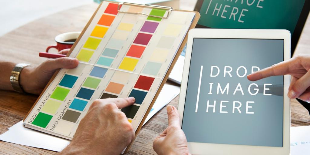
Use color to denote priority, state, or category—not just flair. Pair color with weight or shape so meaning persists for color-blind users. Post an example where you united color and weight to clarify status.
Responsive Typography: From Watch to Wall
01
Use clamp() to scale text smoothly between sensible minimums and maximums, preserving line length and rhythm. Share your clamp settings for headings and body text so others can learn from your breakpoints.
02
Consider viewing distance: a phone at 30 centimeters differs from a TV across the room. Increase size for distance, tighten for proximity. Tell us where your audience reads most and how you adjusted type.
03
Optimize font files, subsets, and loading strategies to avoid FOIT and disruptive layout shifts. A fast font feels invisible. Share your preferred preloading approach and any metrics that improved after optimization.